
I tried all the iPhone 18 Pro colors, and Burgundy isn’t the ‘it’ shade I’d tell you to pick this year
Apple seems to have settled on the iPhone’s design, but it keeps adding a new attention-grabber to its lineup. For the iPhone 17 Pro, that signature color was the rather polarizing Cosmic Orange. This year, it’s Burgundy, a deep red-wine shade that looks beautiful in pictures. I was skeptical about the finish and wondered what it would look like in the real world.
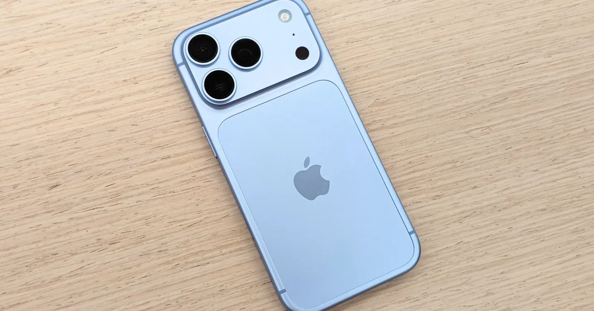
However, after getting my hands on the iPhone 18 Pro, I’ve made up my mind. Burgundy may steal the spotlight on paper, but it isn’t the most eye-catching color in person. That honor goes to the understated Glacier, the light ice-blue shade that doesn’t demand attention but somehow keeps getting mine.
Burgundy is a different story in person
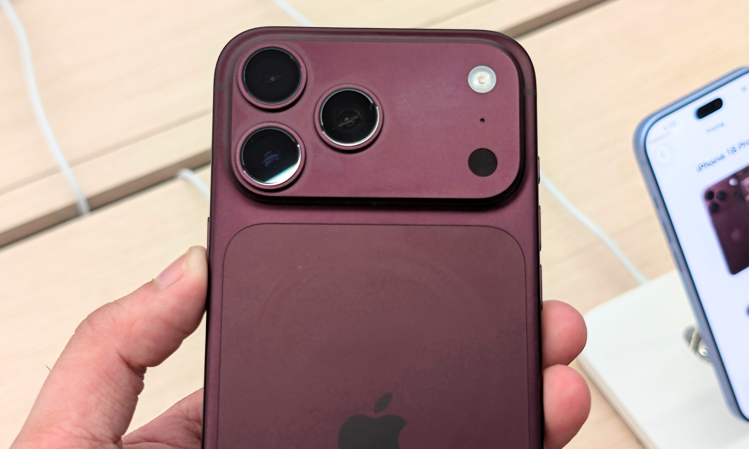
First, let’s talk about the iPhone 18 Pro’s Burgundy shade. In digital renders, the finish comes across as a deep maroon that looks incredibly polished and luxurious. However, even under fluorescent ceiling lights, the colorway feels rather heavy and muted. Take it out of bright light, and it shifts to a muddy brown-purple shade, which is what the geeky world calls metamerism.
Without a case, the dark finish and matte texture act as a fingerprint magnet, and a rather strong one at that. With a transparent case, the phone loses some of its deep wine tones to the reflections on the case’s surface.
I couldn’t capture it, but the phone looked like a plain, dark, almost heavy silhouette under a clear case, especially when held away from the light. There’s nothing inherently wrong with a finish that doesn’t scream for attention.
To me, the iPhone 18 Pro looks best in Glacier
But that’s precisely where my issue lies: Burgundy simply doesn’t attract as much attention as a signature finish should. It doesn’t even come close to last year’s Cosmic Orange finish. The fan-favorite matte Black is already back, so Apple didn’t really need another color to sit quietly at the subdued end of the lineup.
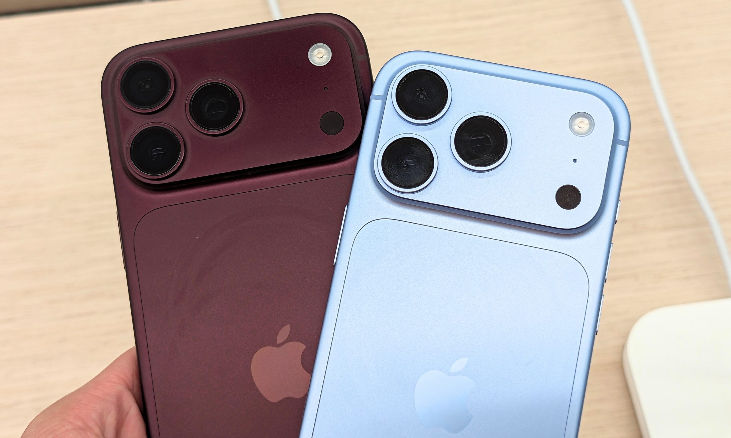
While I was fiddling around with the iPhone 18 Pro and iPhone 18 Pro Max, my gaze kept drifting toward the Glacier finish. In hand, I immediately liked its cooler, fresher look. Under bright hands-on lighting, the finish looks like a crisp, icy blue shade. In natural light, it shifts to a warmer, desaturated pastel with a softer look.
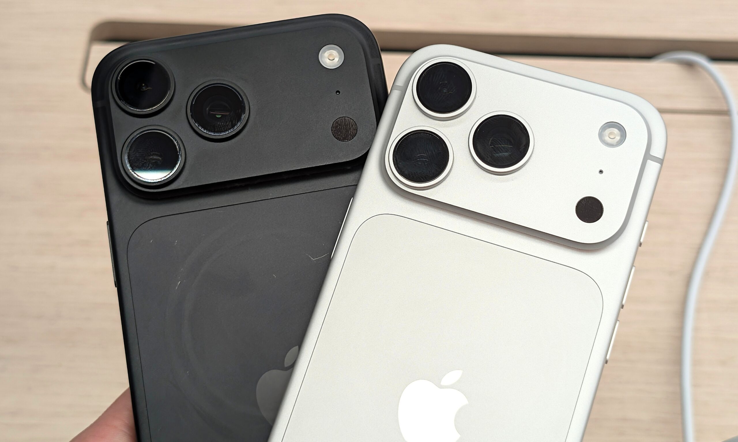
That graceful shift is what makes me pick the Glacier over the Silver.
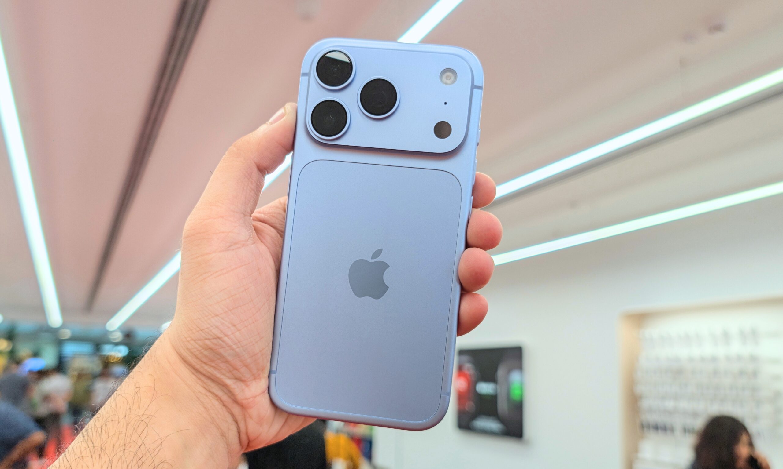
Since it’s a lighter finish, I didn’t notice any residual fingerprints or oil marks on the rear panel either.
Try both the finishes in hand before picking one
More importantly, Glacier has a visual lightness that Burgundy simply doesn’t. The bright finish makes the iPhone 18 Pro feel lighter, fresher, and more effortless in hand, without losing its charm. It also stays radiant, visible through clear or slightly frosted cases, so you don’t lose the color the moment you put one on.
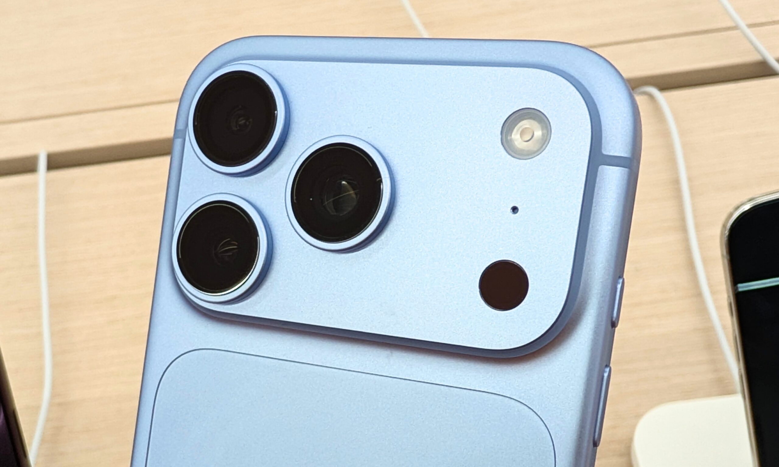
Now, even though I’m a fan of the Glacier finish, your takeaway could be completely different. What feels muted to me could feel like your comfort color, or you might not like the lighter shades at all. However, if I buy the iPhone 18 Pro, it’s definitely going to shine in ice blue.